Visual UX/UI Design
Nouvel Opera Fribourg
IAT438 - Interactive Objects and Environments
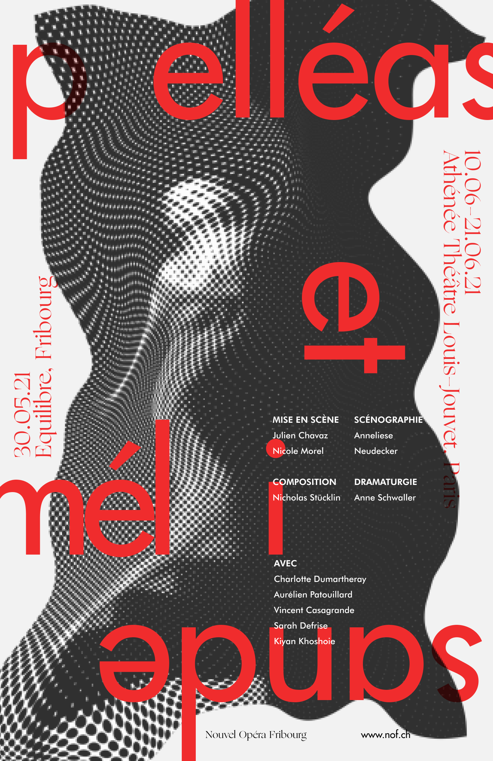
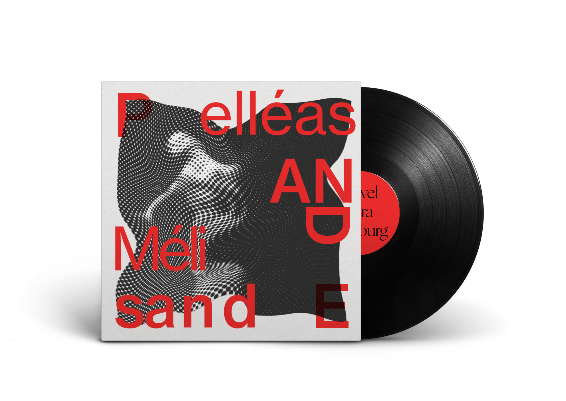
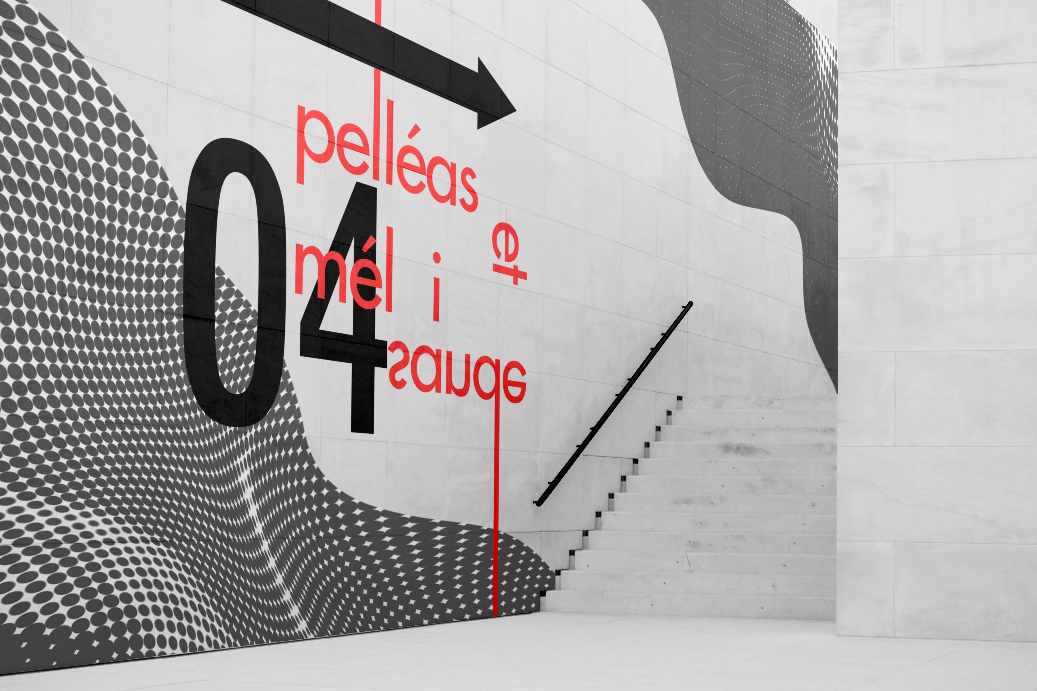
A visual brand identity for Nouvel Opera Fribourg which insights from various designers to guide our process, such as Dan Friedman, Ellen Lupton and design studio NEO NEO.
Role:Visual Design, UX/UI Design, Graphic Design, Prototyping,
Video editing
Tool: Figma, Illustrator + Photoshop + After Effect
Duration: 6 weeks
A visual brand identity for Nouvel Opera Fribourg which insights from various designers to guide our process, such as Dan Friedman, Ellen Lupton and design studio NEO NEO.

About the Company
Nouvel Opéra Fribourg is a Swiss-based performing arts center that produces classical and contemporary musical theater and opera. By using offbeat practices and light-hearted humour, their live productions soften the divide between Western art forms of baroque lyricism and oral traditions.
︎︎
Opportunity
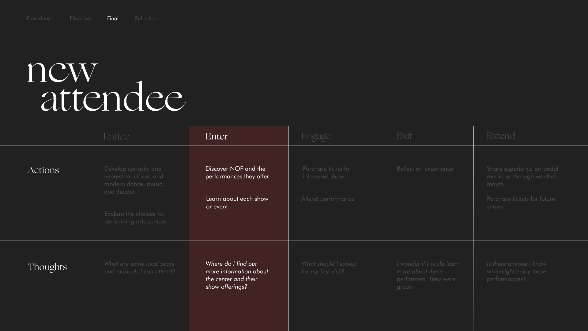
We created a future-state journey map to show an ideal scenario for a new attendee. This is for someone who has recently developed an interest in local performing arts and is seeking to experience diverse forms of live and intimate performances.
We decided to intervene at the Enter stage for our microsite as we saw an opportunity to align what could be considered our persona's biggest goal of going online and learning more about the shows and events that are offered, while providing more value for Nouvel Opera Fribourg as a young performing arts center.
Art Direction
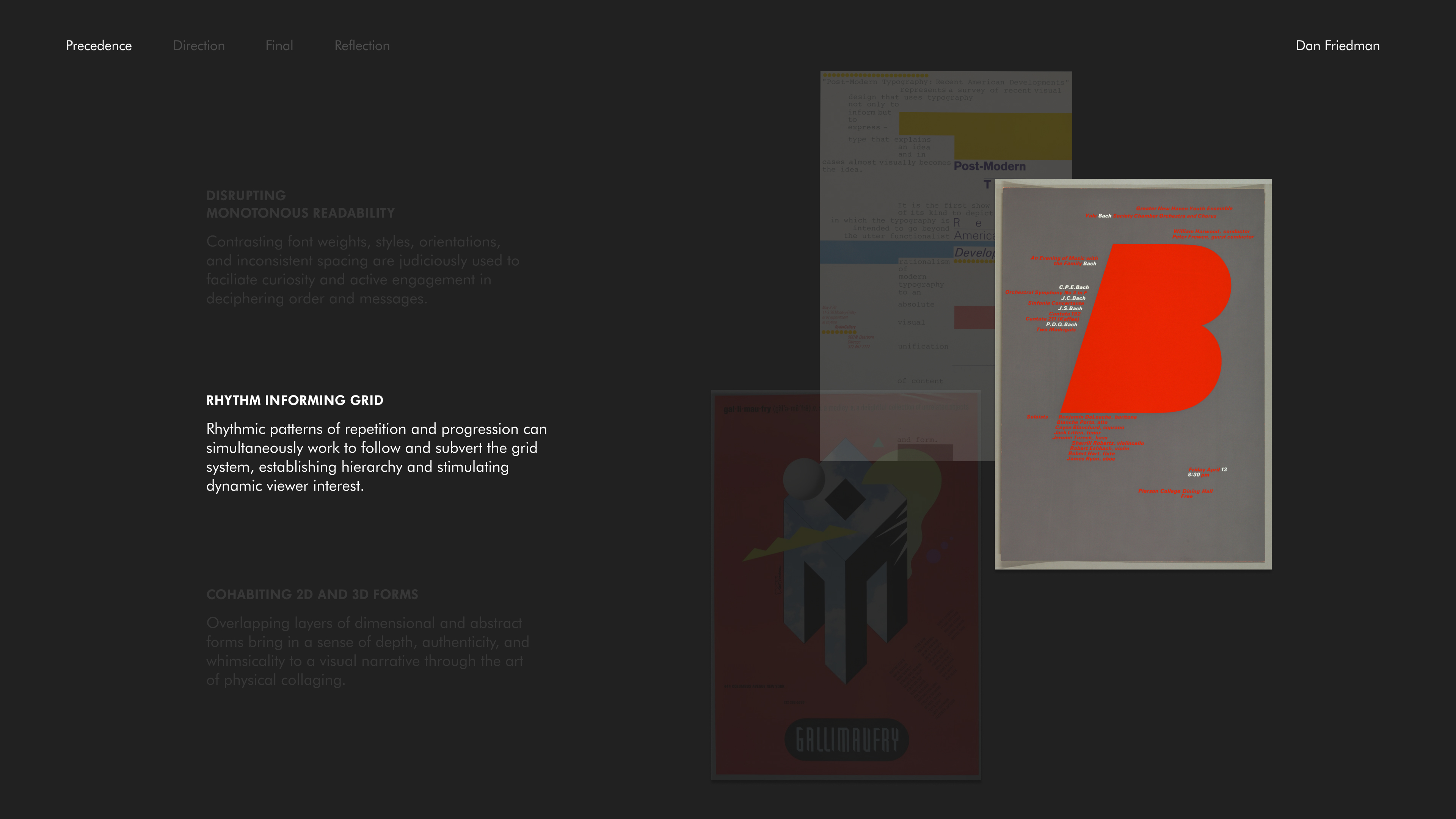
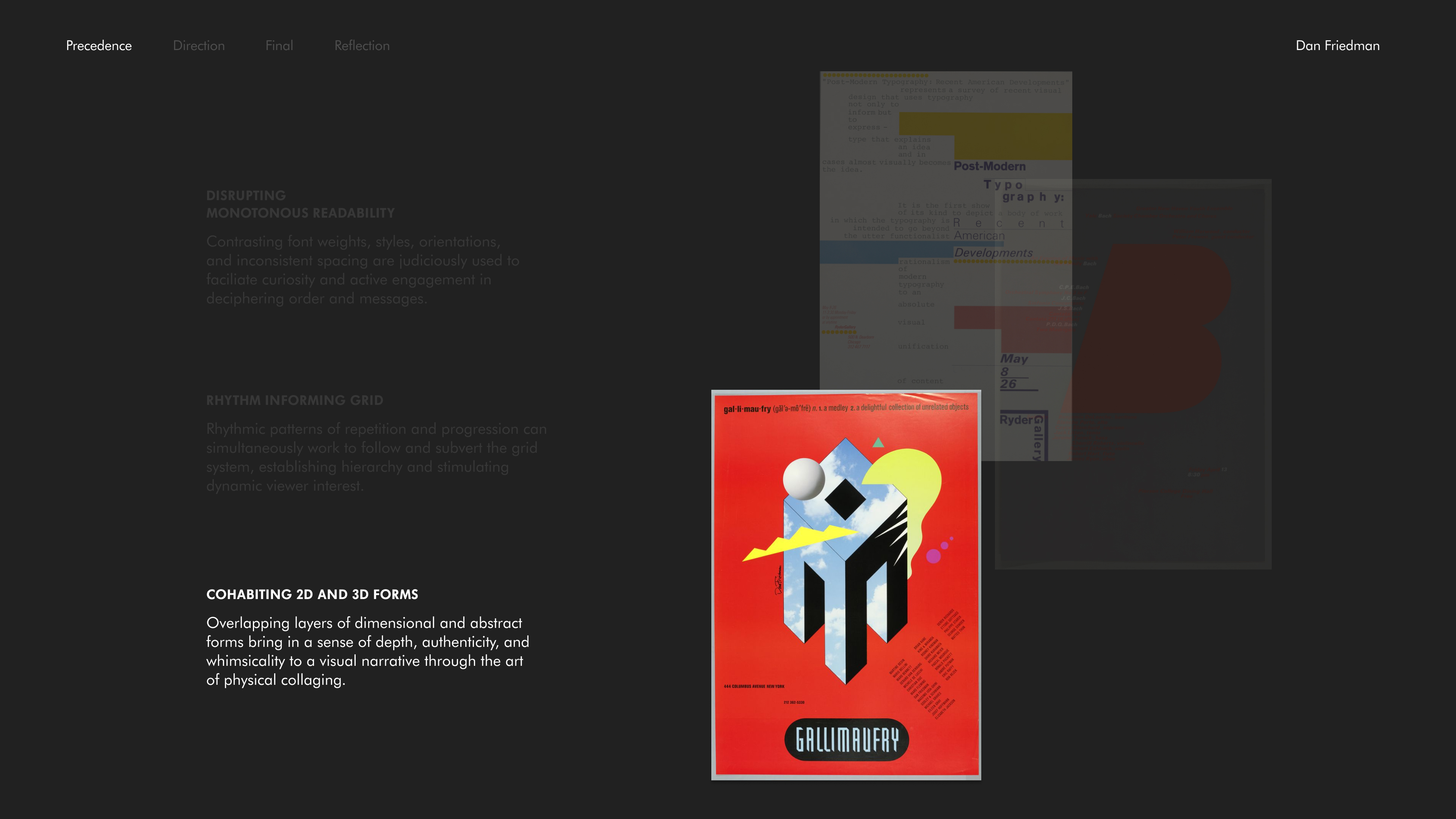
As a prominent contributor of New Wave design, Dan Friedman challenges conventional modern Swiss design by pushing the boundaries between legibility and readability. He later pioneered radical modernism to embrace elements of expressionism that reject the constraints of corporate designs. From our research, these were the qualities we decided to follow through with:
1. Disrupting monotonous readability
2. Rhythm informing grid
3. Cohabiting 2D and 3D forms

Process 1:
Lateral Explorations
The first line of investigation synthesizes the qualities of disrupting monotonous readability, layering shapes and colours alongside principles of texture and framing.
This direction was created for motivating viewers to perform a holistic exploration of the design space and in achieving a dynamic visual scene. The traditions of type are challenged when it's used in atypical ways that hinder legibility but promote the more creative endeavors of readability. As well, the intermixing of shapes and colours with textures can provide interestingly abstract frames for literal objects and images.
This direction was created for motivating viewers to perform a holistic exploration of the design space and in achieving a dynamic visual scene. The traditions of type are challenged when it's used in atypical ways that hinder legibility but promote the more creative endeavors of readability. As well, the intermixing of shapes and colours with textures can provide interestingly abstract frames for literal objects and images.
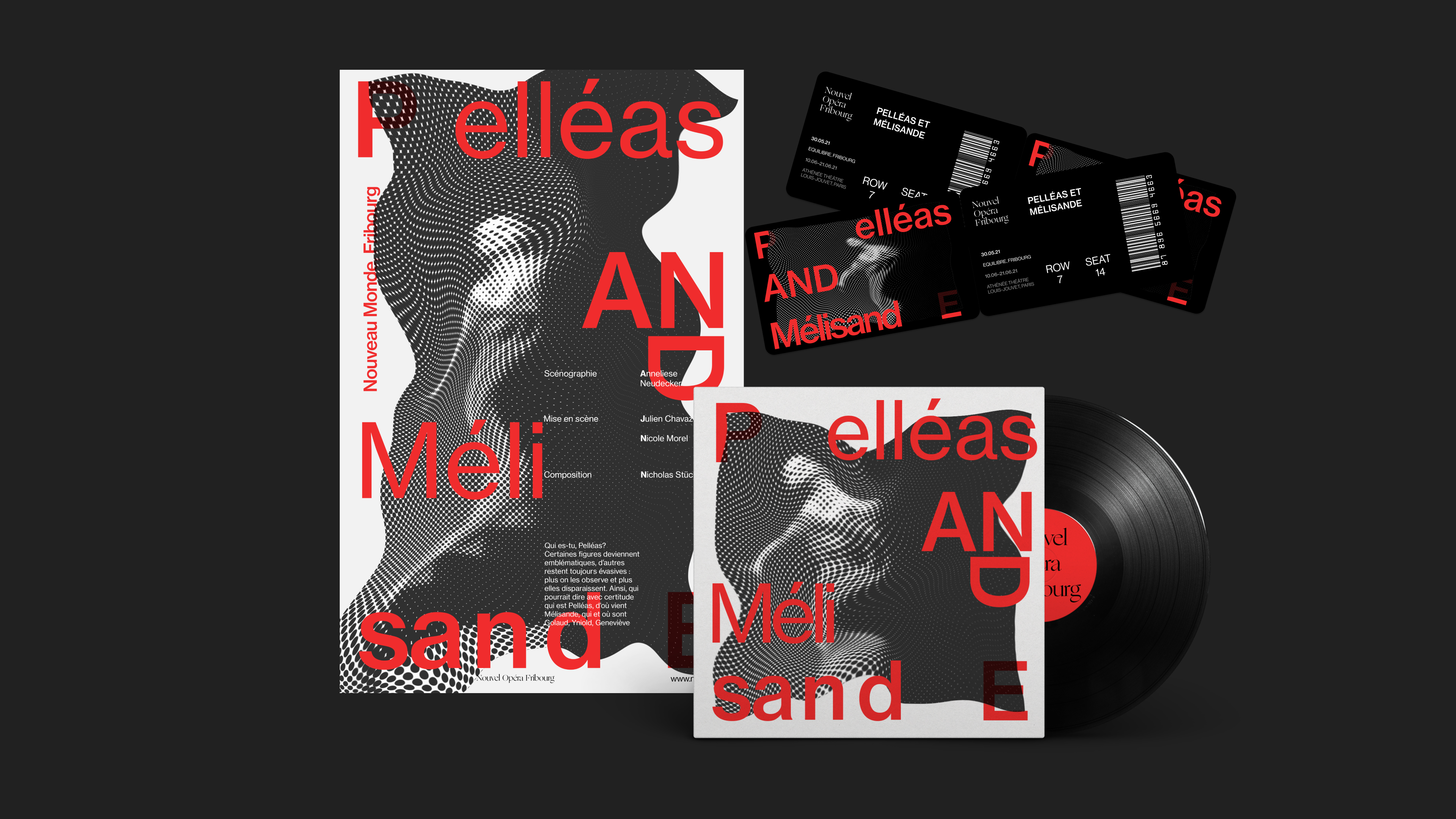
Our second line of investigation couples rhythm informing grid and layering of shapes and colours.
Our intent for the piece was to utilize unconventional spatial elements in driving a dynamic composition. Shapes and texts are then incorporated to establish progressive or repetitious rhythms in reimagining the grid structure.
Our intent for the piece was to utilize unconventional spatial elements in driving a dynamic composition. Shapes and texts are then incorporated to establish progressive or repetitious rhythms in reimagining the grid structure.

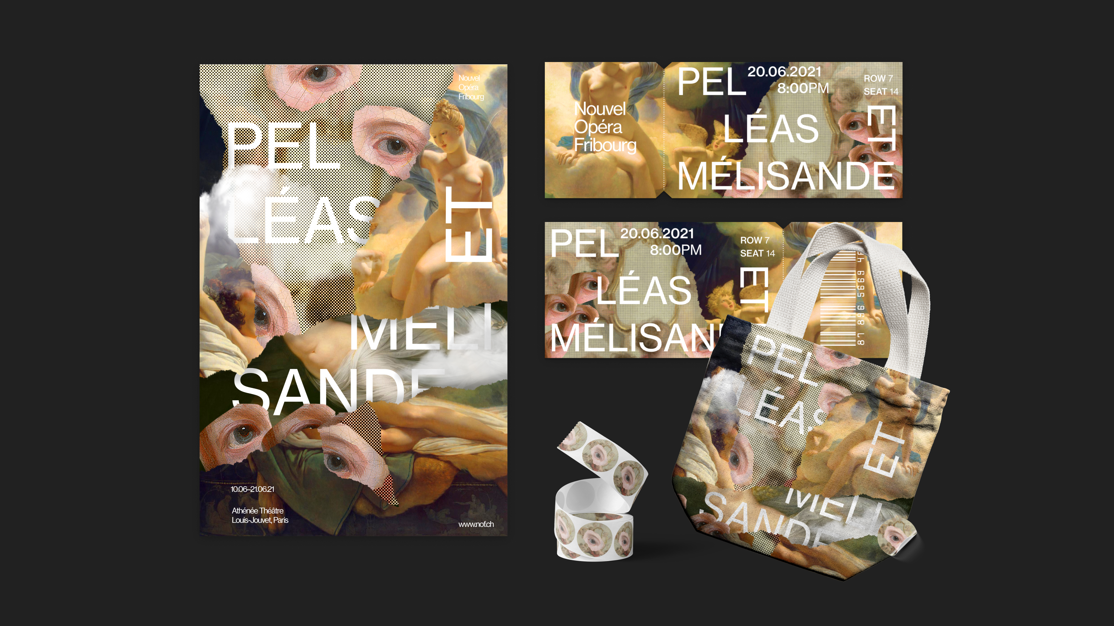
In the last line of investigation, we cohabiting 2d and 3d forms, layering shapes and colors, also incorporating different textures to our graphic assets.
we start to collect pictorial and abstract forms, which bring in a sense of depth, authenticity, and playfulness to a visual narrative using physical collaging.
we start to collect pictorial and abstract forms, which bring in a sense of depth, authenticity, and playfulness to a visual narrative using physical collaging.
Process 2:
Lateral Explorations within
disrupting monotonous readability, layering shapes and colours alongside principles of texture and framing.
Upon all the explorations, we settled down with one line of investigation featuring the quality of disrupting monotonous readability along with principles of layering shapes and colours, incorporating textures, and framing text and images.
Aiming to focus on challenging the notion of functional readability, we utilized unconventional typographic practices to stretch the limits of monotonous and passive reading, while integrating overlapping layers and textures to provide dynamism through depth.
Aiming to focus on challenging the notion of functional readability, we utilized unconventional typographic practices to stretch the limits of monotonous and passive reading, while integrating overlapping layers and textures to provide dynamism through depth.
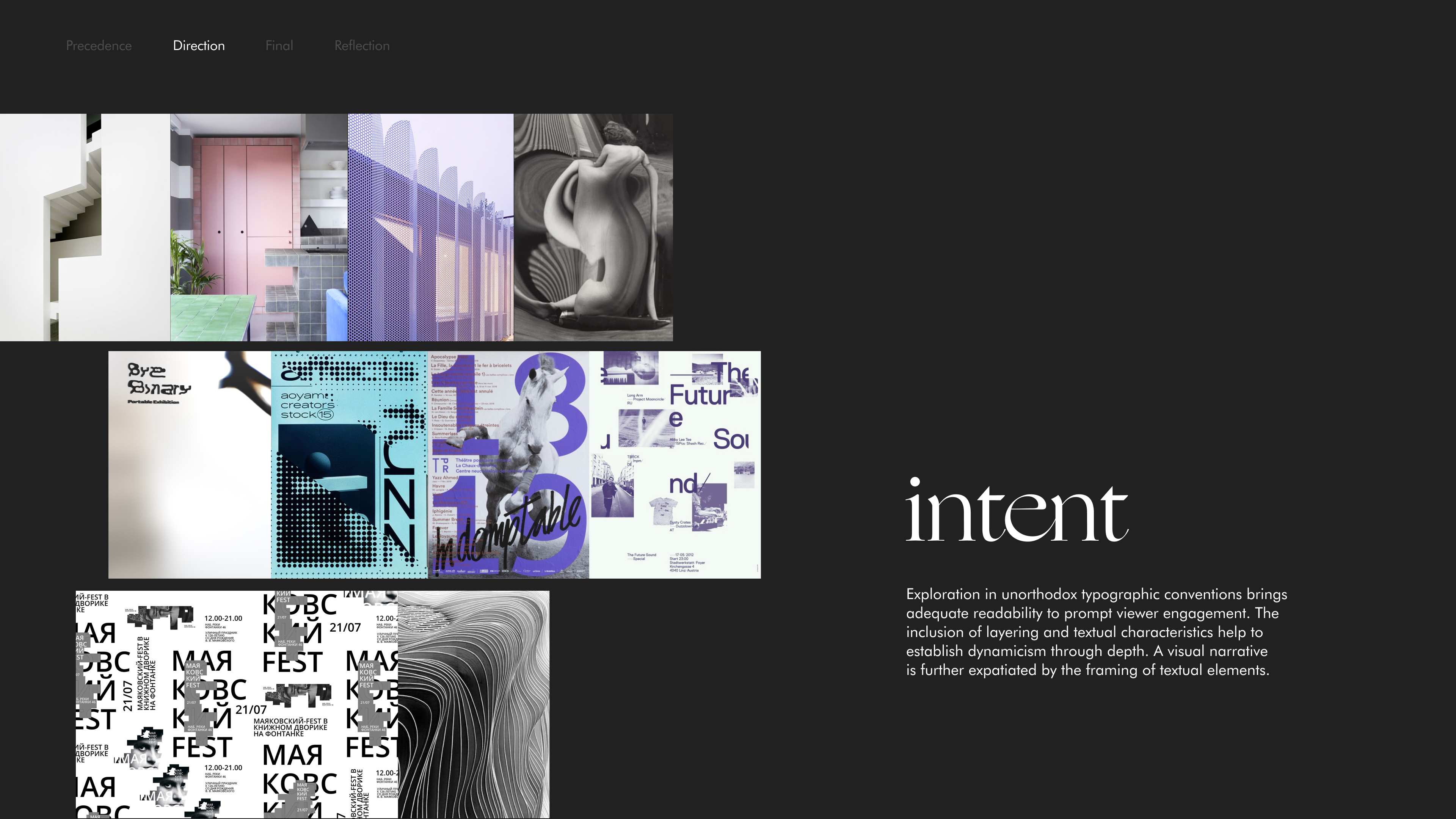
As we moved forward in our progress, we decided to further expand Friedman's quality of challenging passive reading into three specific techniques as it would provide the team with a more pointed lens for exploration and execution.
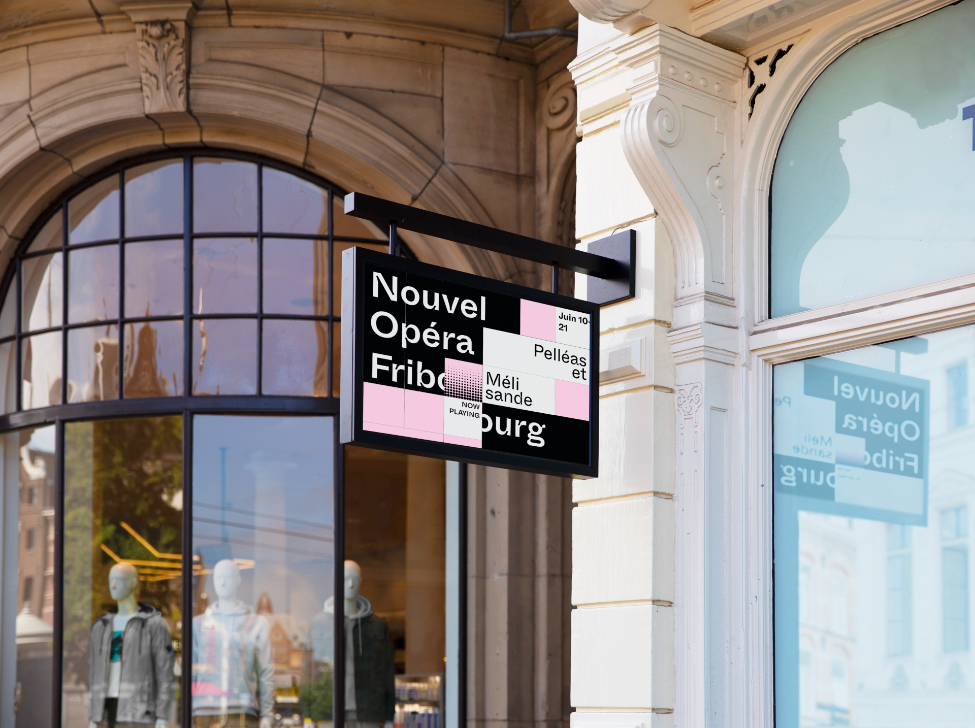
IRREGULAR SPACING AND CONTRASTING STYLES :The first of these being irregular spacing and contrasting styles to break conventional and "corporate-like" practices in favour of viewer interest and excitement.
OBSTRUCTING FLOW :The second focused on obstructing text with organic and irregular polygons to disrupt a linear and normalized reading flow while demanding active participation in decoding information.
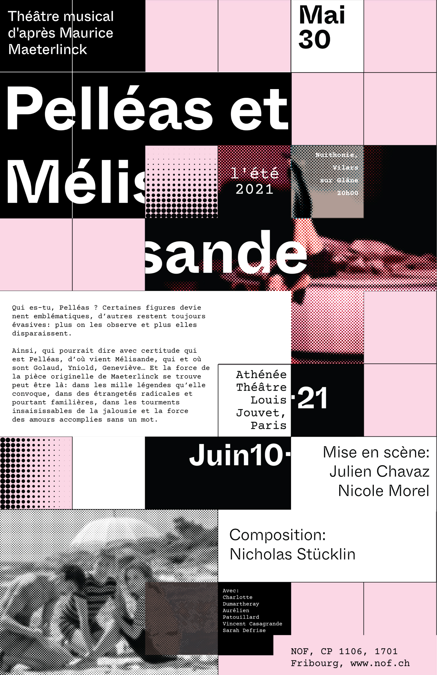
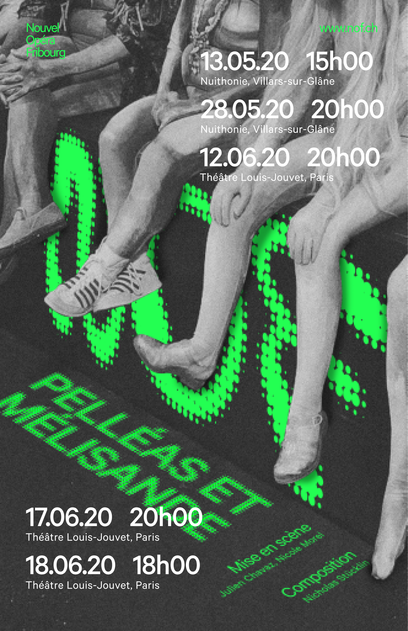
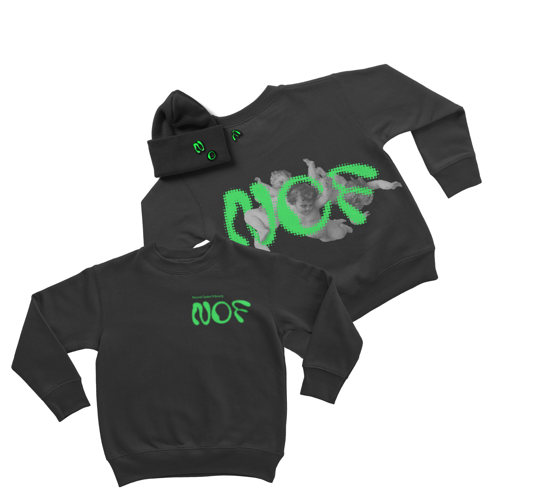
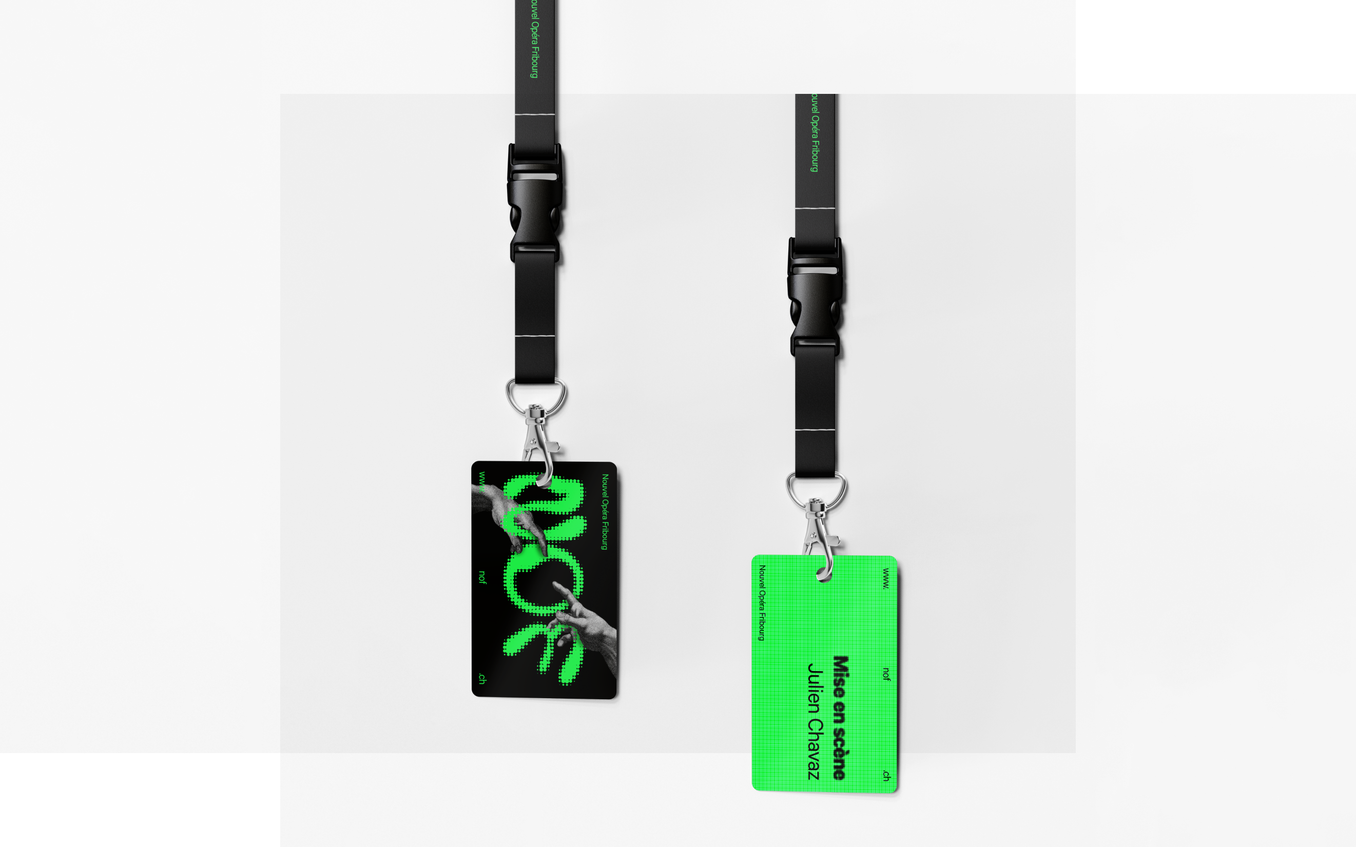
INTERWEAVING TYPE AND IMAGE : And the third blurs the boundaries of imagery and text, unifying the two different mediums into one, creating a compelling tension that draws in viewers.

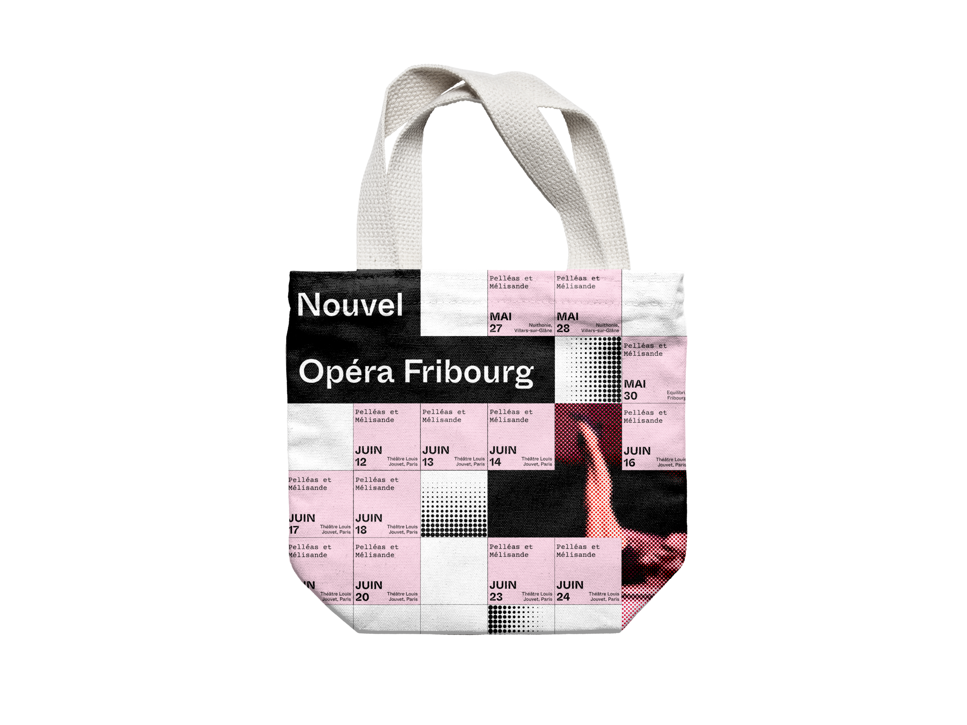
Final Direction
Although we explored many ways of extending the concept of interweaving text and image to our microsite, its specificity constrained the team a bit too much and we ended designing in a loop with no real progress. Being stuck in this rut led us to revisit our previous explorations that had more potential moving forward.
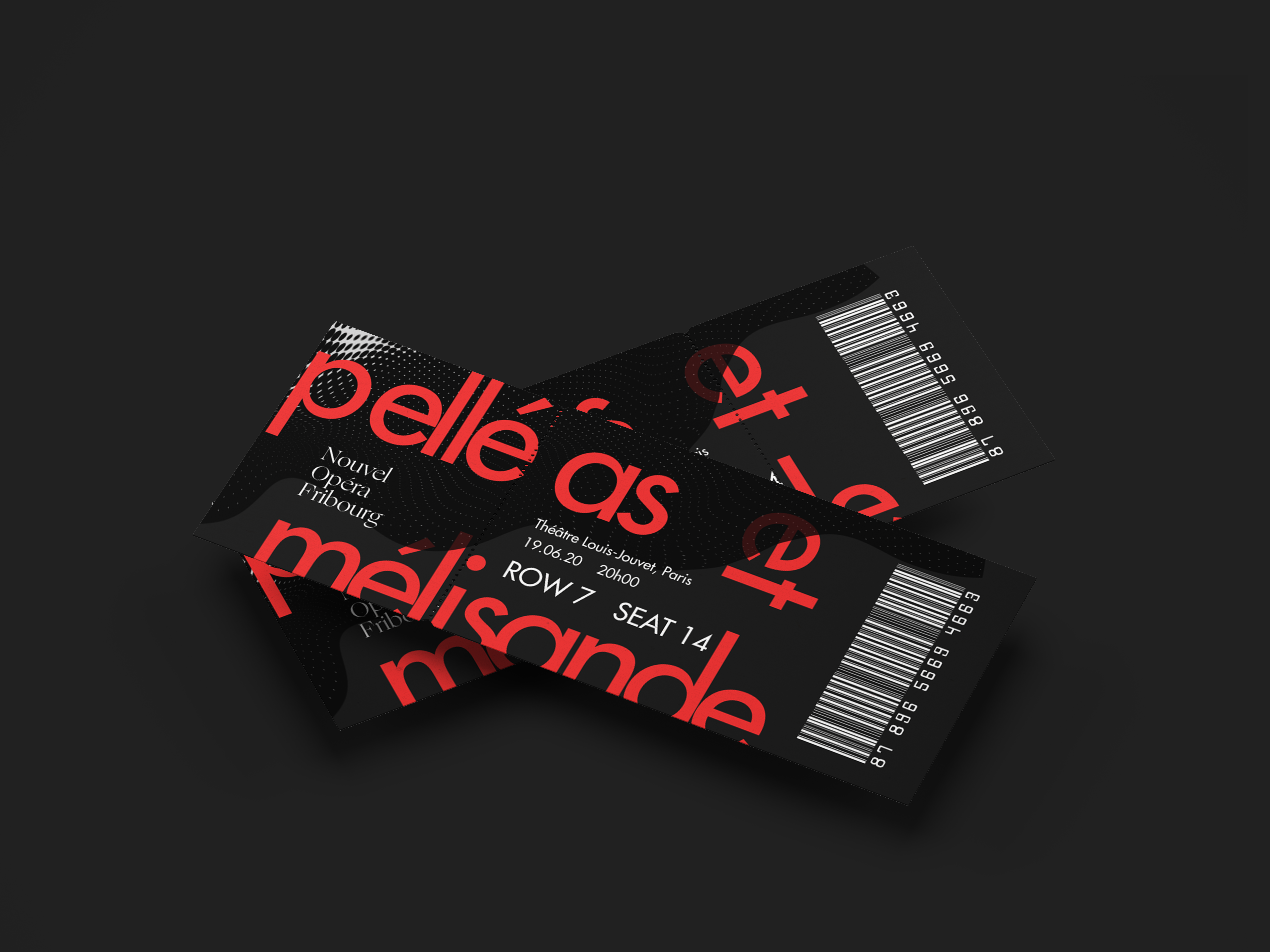
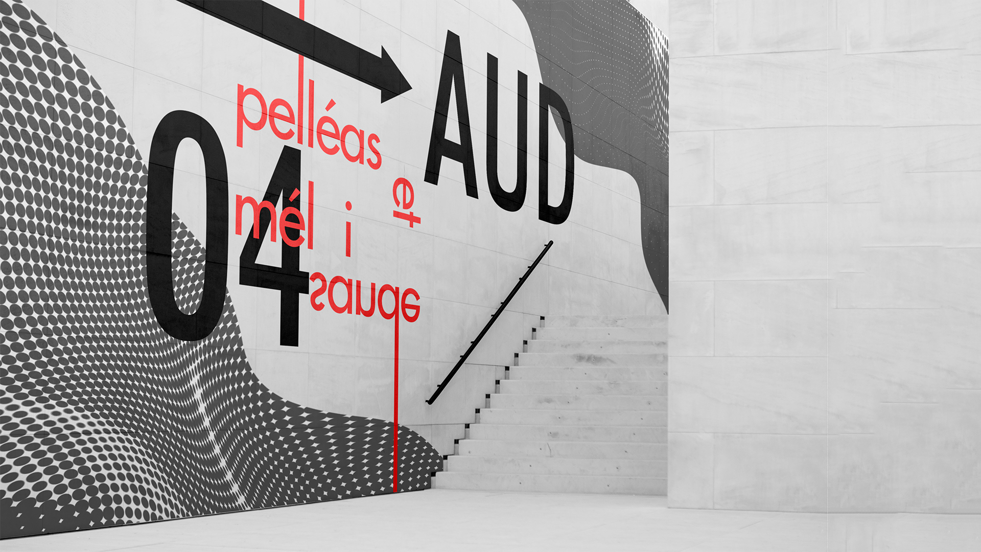
So, our revised direction is an exploration of Friedman's irregular spacing and contrasting styles in addition to framing, and layering shapes, colors, and textures.
So, our revised direction is an exploration of Friedman's irregular spacing and contrasting styles in addition to framing, and layering shapes, colors, and textures.
Moodboard
Some design attributes that were considered in the making of this exploration: dense texture to obscure literal imagery, warping images to express emotion, combining layers and spacing to stimulate active reading, and softening rigid forms with organic lines.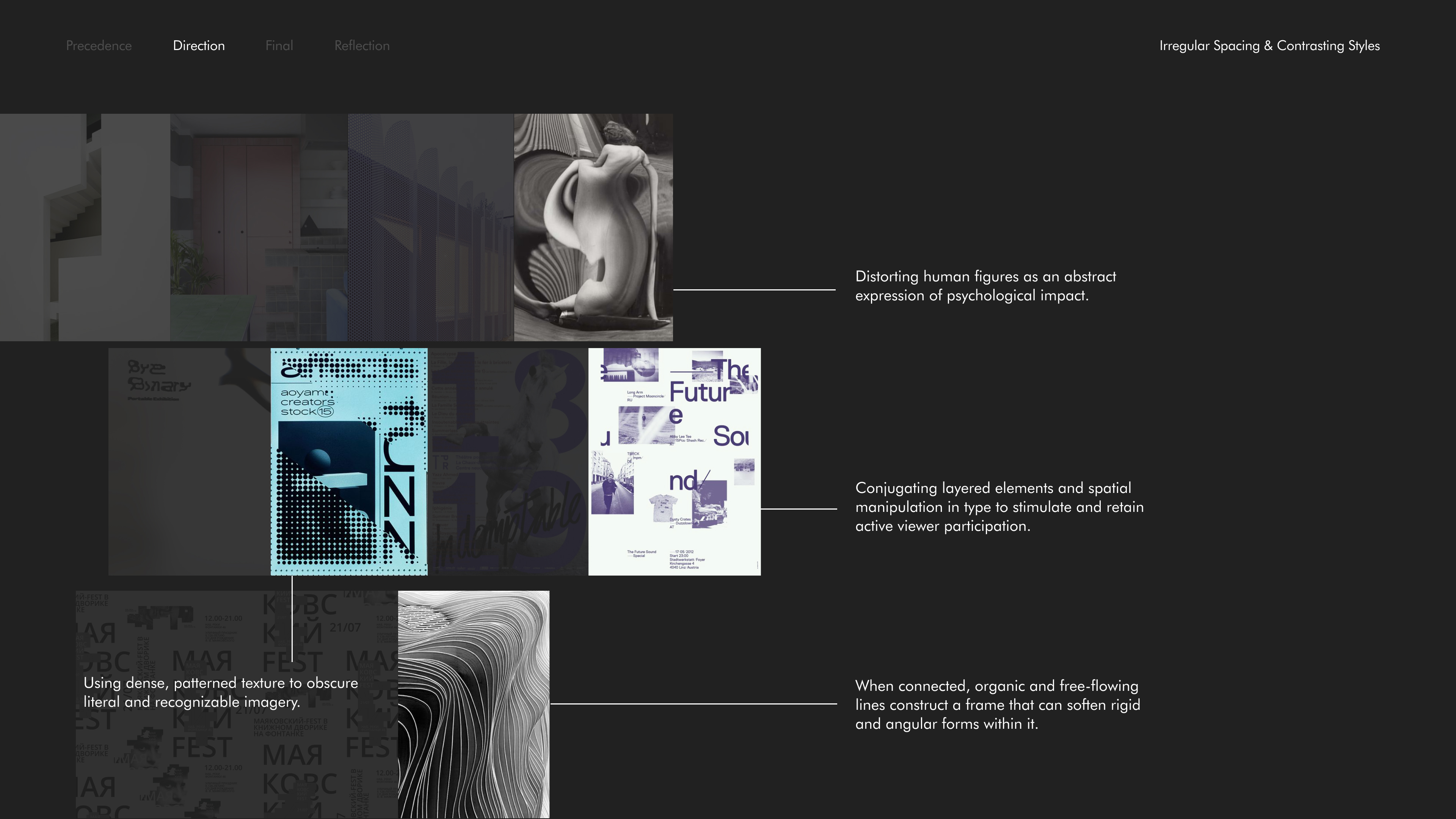
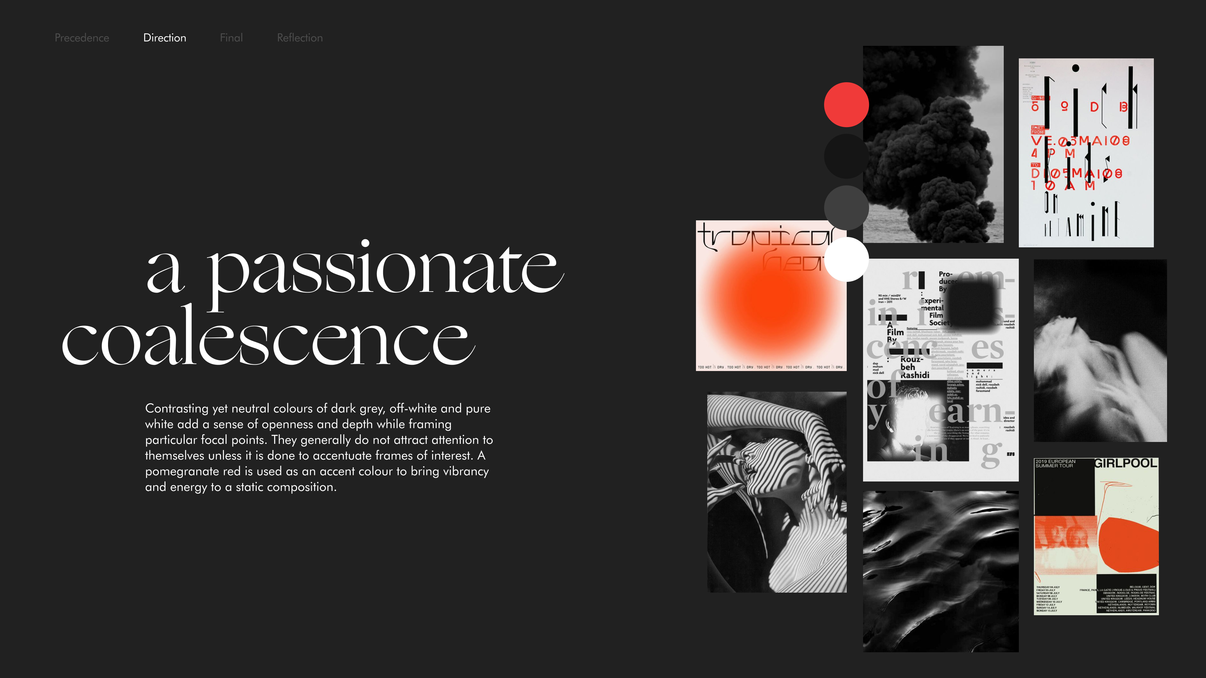
We paired Futura (foo-tura) and Ogg for their contrasting characteristics. Futura is used to highlight its elongated ascenders and provide optimal legibility for smaller-sized content, while the classy calligraphic traits of Ogg resonate with the free-forming elements and add personality.

Consisting of a dominant achromatic visual presence, the red is used as an accent to balance flatness and provide a striking contrast to bring vibrancy and energy.
Interaction
In our interaction exploration, we had revisited our qualities and principles and examined how we could transfer them into expressive and logical experiences on our microsite. We were fascinated by how spatial intervals can be used to play with ambiguity while creating denial and reward.
And also, how multi-dimensional layering can stimulate engagement and surface a multitude of content through depth.
And how texture and motion can cohabit to create a dynamic and energizing experience.
For our microsite, we decided to switch our header and body font, opting for Ogg for headers and Futura for body copy. We did so since, during exploration with the site, we found that using Ogg for small body copy was difficult to read, and we thought that showcasing Ogg in larger text, like with our landing page and show titles, presented the text in a visually compelling way.
For our microsite, we decided to switch our header and body font, opting for Ogg for headers and Futura for body copy. We did so since, during exploration with the site, we found that using Ogg for small body copy was difficult to read, and we thought that showcasing Ogg in larger text, like with our landing page and show titles, presented the text in a visually compelling way.

Discovering shows
HOVER: Reveal complete show name, bite-sized synopsis, and an animation of textured organic shapes framing the show.
CLICK: Direct users to more content and information about the selected show.
CLICK: Direct users to more content and information about the selected show.
About Klanggg
Provide a summary, date, and location about Klanggg as an event, as well as a listing of the six shows presented.
HOVER: Reveal the show’s genre and an associated image.
HOVER: Reveal the show’s genre and an associated image.
Learning about a elected show
SCROLL: Detailed information is layered between the pieces of the show name.
CLICK: Reveal more detailed information, expand videos full-screen, and guide users to next show.
HOVER: Clarify navigational iconography and present actionable options.
IMAGES: Achromatic color palette allows for viewable images while still tying together with art direction.
CLICK: Reveal more detailed information, expand videos full-screen, and guide users to next show.
HOVER: Clarify navigational iconography and present actionable options.
IMAGES: Achromatic color palette allows for viewable images while still tying together with art direction.
Purchasing tickets
HOVER: Broken up words are stitched together and reveals process information.
CLICK: Interact with text fields and direct users to the next step of the process.
CLICK: Interact with text fields and direct users to the next step of the process.
Reflection
Over the course of the past few weeks, we really learned a lot about the design process. Making sure that we're not trapped into thinking too linearly, not getting overly attached to an idea, and being able to pivot away if the idea isn't able to progress forward.